Understanding Value in Watercolor
- Mar 13, 2025
- 4 min read
Have you ever felt like your watercolor paintings look a little flat? Maybe the colors are there, the shapes are right, but something’s missing. That missing piece is often value! Value is one of the most important elements of painting, especially in botanical watercolor, where subtle shifts in light and shadow make all the difference in creating depth.
This post will walk you through what value is, why it matters, and some simple ways to practice using it in your botanical paintings. By the end, you’ll feel more confident adding dimension, contrast, and depth to your artwork!
What is Value?
Before we dive into how value can transform your botanical watercolor paintings, let’s break it down simply. Value is just how light or dark a color is. That’s it! Imagine you took a black-and-white photo of one of your paintings. Value is what would still be visible, even without color. It helps define form, create depth, and give your subject that 3D look.
Think of a branch of blueberries. If you paint them all one shade of blue, the berries will look flat and uninteresting. Plus, you won’t be able to clearly define where the berries overlap. But if you add darker blues in the shadowed areas and lighter pigments where the light hits, suddenly those berries look round and real! Value is what gives objects a sense of shape and realism, and it’s one of the most important things to master in watercolor.

Why is Value Important in Botanical Watercolor?
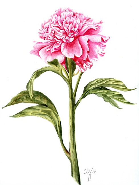
When painting flowers and leaves, value helps show which petals are in front and which are tucked behind, where the light is hitting, and how the leaves are curved. A well-balanced range of light and dark values will make your botanical subjects pop off the page and feel full of life.

Exercises to Understand and Practice Value
One of the best ways to practice value is by using a single color so that you can see the contrast of light and dark without focusing on different colors. Shifting to thinking about images in grayscale is a really helpful tool when learning value, so we’re going to do these exercises using Payne’s Gray – a dark blue/gray that can look almost black at its darkest. Sticking with one color allows you to focus purely on light and dark.

Here are a few easy exercises to try:
Create a Value Scale
On a piece of watercolor paper, draw out a long rectangle and section it off into squares. Start by painting the darkest mixture possible on one side. Then gradually add more water to your mix and make each square lighter and lighter. This will help you learn how to balance water control to create lighter values.
Wet into Wet Value Study
Try painting a few shapes with a light wash of Payne’s Gray. While the shape is still wet, add additional pigment to one side of the wet area and blend it out to create a seamless gradient. (You can learn more about this technique in this blog post!)
Monochrome Composition Challenge
Once you’re comfortable with value shifts, challenge yourself to create an entire painting using only Payne’s Gray. Choose a subject (might I suggest flowers? 😊) and focus on painting with just one color using different values to add depth and realism.
I challenged my students in The Garden Studio to try this monochromatic approach to painting, and the results were fantastic! The students all came away with lots of “a-ha” moments and many of them said that it was a challenge that they learned a lot from. I hope you’ll tackle the challenge and learn a lot too! By practicing with just one color, you’ll gain confidence in handling values, making your future paintings even more lifelike and 3D.


Artwork by: Katie Homan (left) and Kim Merrett (right)


Artwork by: Kathy Roush (left) and Genny Morley (right)
Bringing Value into Your Watercolor Paintings
Once you’re comfortable with value scales and monochrome studies, it’s time to bring these lessons into full-color botanical paintings. Here are a few ways to apply what you’ve learned:
Squint at your reference photo to identify the lightest and darkest areas before you start painting. Squinting ensures that you see just the most basic shapes and can help you identify value more easily!
Mix a range of values in your palette so you have light, mid-tone, and dark versions of each color you’re painting with.
Glaze strategically to build up shadows and define shapes without overworking your painting. Not sure what glazing means or how to do it? Check out this post!
Take a photo of your artwork and edit it to be black and white. This can help you see if you need more shadows or highlights.


Like anything in watercolor, mastering value takes time and practice. The good news? Every time you put brush to paper, you’re training your eye to see value more clearly.
Whether you’re painting a single petal study or a full floral composition, keep playing with light and shadow, and don’t be afraid to experiment.
I’d love to see your practice pieces! Share your Payne’s Gray exercises or botanical paintings in my Free Watercolor Florals Facebook Group. I can’t wait to see what you create!
Happy painting,
Alex